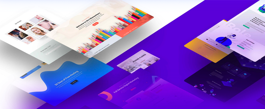
It has become crucial to create a responsive WordPress website in 2023, emphasizing the importance of responsive web design. If you are totally new to web development or want a guide to starting web development even without a degree, here you go. It is crucial to make sure that websites can adjust to various screen sizes and offer the best user experiences given the increasing use of mobile devices. Check out this guide if you are looking for becoming a web designer without coding. WordPress is the best platform for this job thanks to its broad variety of responsive themes and plugins that enable users to build beautiful and user-friendly websites. Businesses and individuals can build websites that respond to the changing needs of their audience and offer seamless experiences across devices by utilizing WordPress’ flexibility and responsive design capabilities. Here is a list of 9 tips to create a responsive wordPress website and boom your online presence.
1. Planning for Responsive Success

- Define Your Website’s Goals and Target Audience – Starting with clear goals and identifying your target demographic is essential if you want to build a responsive website that engages your audience. Here is a guide for you on 7 proven ways to build your website. You may align your design and content choices by being aware of the goals of your website, whether they be to sell things, generate leads, or provide information. Additionally, identifying your target audience helps tailor the website’s messaging, layout, and functionality to meet their specific needs and preferences. You can establish a strong foundation for a successful responsive website by precisely identifying your goals and comprehending your target audience.
- Conducting Competitor Research and Analysis – In this quick-paced digital industry, standing out of your competition is a must to achieve success. Conducting thorough competitor research and analysis provides valuable insights into what others in your industry are doing, helping you identify trends, strengths, and areas for improvement. By studying your competitors’ websites, you can gain inspiration, identify unique selling points, and understand what resonates with your target audience. Utilize this knowledge to create a standout, user-centric responsive website.
- Creating a Wireframe and Site Structure – Creating a wireframe helps you outline the layout and structure of your site. It serves as a template, directing the creative process and guaranteeing a unified and user-friendly result. By mapping out the different sections, pages, and navigation of your website, you can better organize your content and optimize the user journey. This step sets the foundation for a well-structured and visually appealing website.
2. Choosing the Right Theme and Plugins
Selecting the perfect theme and plugins is crucial for creating a functional and visually appealing website. A responsive WordPress theme ensures that your site adapts seamlessly to different screen sizes and devices, enhancing user experience. Look for themes that complement the objectives, sector, and audience of your website.
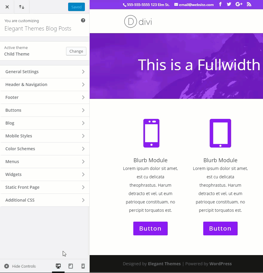
A. Selecting a Responsive WordPress Theme
Choose a responsive WordPress theme for a visually stunning and fully functional website on all devices. Responsive themes automatically adjust their layout and design to fit different screen sizes, providing an optimal user experience. Here is a guide that contains 9 wordPress themes suitable for blogging. Go for themes that are mobile-friendly, offer customization options, and have good reviews. Consider your website’s content and goals when selecting a theme to ensure it aligns with your brand and style. However, there are also many responsive website builders present in the market today.
B. Essential Plugins for Enhancing Responsiveness
Plugins are effective tools that help improve your WordPress website’s responsiveness. There are several essential plugins designed to optimize mobile performance, improve site speed, and enhance user experience. Look for plugins that offer features like image optimization, caching, mobile optimization, and responsive menu options. These plugins can make it easier for users to navigate your website, help it load faster, and adapt to various devices
C. Customizing Themes for a Unique Look and Feel
While choosing a pre-made theme is a terrific place to start, customizing it can give your website a distinctive appearance. WordPress makes it easy to transform the appearance and atmosphere of your website. With the ability to adjust layouts, sizes, fonts, colors and more, you have varieties of option to create a customized and unique website. Make sure to customize your chosen theme to reflect your brand identity and create a visually appealing website. Pay attention to responsive design elements during customization to ensure your website remains mobile-friendly and user-friendly across all devices.
3. Optimizing Content for Mobile Devices
Ensure a consistent user experience across screen sizes by optimizing content for mobile devices during website development. You can follow this guide to understand how to make a responsive website for mobile. Following are some key aspects to consider
A. Crafting Engaging and Readable Text
Ensure that your text is easily readable on mobile devices by using legible fonts, appropriate font sizes, and sufficient line spacing. Break up content into shorter paragraphs and use subheadings to enhance readability. Focus on concise and engaging content that grabs the attention of mobile users.
B. Optimizing Images for Fast Loading and Display
To improve the loading speed of your website on mobile devices, optimize your images. Compress images without compromising quality to reduce file size. Use the appropriate image formats (such as JPEG or WebP) and specify image dimensions to ensure proper scaling on different devices. This helps to minimize load times and improve user experience.
C. Incorporating Videos and Media Responsively
When including videos or other media on your website, ensure they are responsive and adaptable to different screen sizes. Use HTML5 video players that support mobile playback and employ responsive design techniques to ensure proper scaling and layout adjustments. Consider the use of autoplay and muted options for mobile devices to improve user experience and reduce data usage.
You may design a website that offers a seamless and interesting experience for mobile consumers by optimizing your content for mobile devices. Focus on crafting readable text, optimizing images for fast loading, and incorporating responsive videos and media to ensure a visually appealing and user-friendly mobile experience.
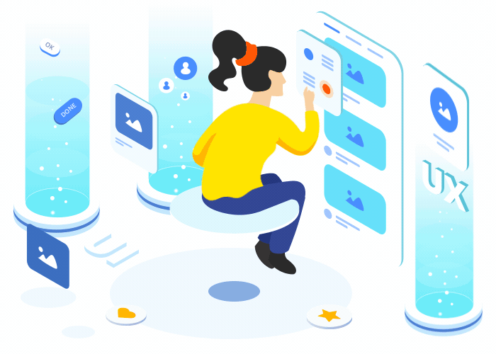
4. Designing a Seamless User Experience
When designing a seamless user experience in WordPress, focus on implementing intuitive navigation and menus, organizing content for easy scanning and accessibility, and utilizing responsive forms and contact elements. You may easily develop a user-friendly website that caters to the needs and preferences of your target audience by utilizing the different tools, plugins, and themes offered by WordPress.
A. Implementing Intuitive Navigation and Menus
In WordPress, you can create intuitive navigation and menus by using built-in features such as custom menus. You can easily organize your pages, posts, and categories, and arrange them in a logical hierarchy. You may add, remove, and customize menu items with WordPress’ menu editor to give your users an easy navigating experience.
B. Organizing Content for Easy Scanning and Accessibility
WordPress has a number of tools and plugins that can be used to organize information for accessibility and simple scanning. You can use headings, subheadings, and bullet points to structure your content effectively. Additionally, WordPress themes often come with accessibility features built-in or can be enhanced using accessibility plugins. You may make sure that your material is accessible to a larger range of visitors by following accessibility guidelines.
C. Utilizing Responsive Forms and Contact Elements
WordPress provides plugins and form builders that enable you to create responsive forms and contact elements. These tools enable you to create forms that adjust to various screen sizes and devices, providing a smooth user experience. By utilizing responsive design techniques and integrating them into your forms and contact elements, you can optimize user interaction and encourage conversions.
5. Mobile-Friendly Performance and Speed
By focusing on optimizing website loading speed, minimizing HTTP requests and file sizes, and implementing caching and compression techniques, you can enhance the mobile-friendliness and performance of your WordPress website.

A. Optimizing Website Loading Speed
Using cache plugins, optimizing pictures, and reducing CSS and JavaScript files can all help your WordPress page load faster. These techniques help reduce load times and enhance the mobile-friendliness of your site.
B. Minimizing HTTP Requests and File Sizes
By combining CSS and JavaScript files, optimizing images with compression plugins, and employing techniques like lazy loading, you can minimize the number of HTTP requests and reduce file sizes. On mobile devices, this leads to quicker loading times and greater performance.
C. Implementing Caching and Compression Techniques
WordPress offers caching plugins that allow you to implement browser caching and server-side caching, which help speed up your website. Additionally, compression plugins can be used to compress files and reduce bandwidth usage, further improving mobile performance.
6. Testing and Ensuring Responsiveness
By focusing on testing and ensuring responsiveness, conducting cross-browser and cross-device testing, validating code for compliance and compatibility, and incorporating user testing and feedback iterations, you can create a responsive and user-friendly website in WordPress.aching, which help speed up your website. Additionally, compression plugins can be used to compress files and reduce bandwidth usage, further improving mobile performance.
A. Conducting Cross-Browser and Cross-Device Testing
In WordPress, it’s crucial to test your website’s responsiveness across different browsers and devices. This ensures that regardless of the platform they use, all users can efficiently access and use your website.
B. Validating Code for Compliance and Compatibility
WordPress provides tools to validate your website’s code for compliance with web standards and compatibility across different browsers. By ensuring clean and valid code, you can avoid rendering issues and ensure a seamless user experience.
C. User Testing and Feedback Iterations
WordPress allows you to gather user feedback and conduct usability testing to identify any issues or areas for improvement. You may improve your website’s responsiveness and user experience by incorporating user feedback and implementing incremental adjustments.
7. Mobile SEO and Optimization
Mobile SEO is the practice of improving your website’s exposure and rating on mobile devices through optimization for search engines. It involves techniques like optimizing mobile-friendly content, improving page load speed, and implementing mobile-friendly design elements. In WordPress, you can utilize plugins and themes that offer mobile optimization features, such as mobile-friendly layouts and responsive image optimization.
A. Implementing Responsive SEO Best Practices
This focuses on implementing SEO best practices that are specifically tailored for responsive websites. It includes optimizing page titles, meta descriptions, and headings for mobile devices, as well as ensuring proper mobile indexing and structured data implementation. WordPress provides various SEO plugins and tools that can assist in optimizing your website for both desktop and mobile users.
B. Enhancing Mobile Search Visibility and Rankings
This involves strategies to improve the visibility and rankings of your website in mobile search results. It includes optimizing your website’s mobile user experience, improving mobile site speed, and ensuring mobile-friendly navigation. WordPress offers plugins and themes that can help optimize your website for mobile search, including features like mobile sitemaps and AMP (Accelerated Mobile Pages) support.
C. Mobile-Friendly Analytics and Tracking
This focuses on monitoring and evaluating how well your website performs on mobile devices. It involves using analytics tools and plugins to gather data on mobile traffic, user behavior, and conversions. WordPress supports various analytics integrations that provide insights into your mobile audience, allowing you to make data-driven decisions for mobile optimization.
8. Accessibility and inclusive design
Website accessibility for all users, regardless of their skills, is crucial in the modern digital world. Accessibility and inclusive design play a crucial role in making websites usable and enjoyable for everyone. WordPress provides a range of tools and features to help website owners create accessible and inclusive websites.
A. Ensuring Website Accessibility for All Users
Designing and building websites in a way that individuals with disabilities can effectively perceive, browse, and interact with the material is known as website accessibility. You can adhere to a number of procedures in WordPress to make your website accessible:
- Use a responsive and mobile-friendly design: Make sure your website is accessible to people who may use mobile devices or assistive technology by making sure it adjusts to multiple screen sizes and devices.
- Provide alternative text for images: Adding descriptive alt text to images helps visually impaired users understand the content through screen readers.
- Ensure proper color contrast: Choose color combinations that provide sufficient contrast between text and background, making it easier for users with visual impairments to read the content.
B. Adhering to Web Content Accessibility Guidelines
A set of internationally accepted guidelines for website accessibility is known as the Web Content Accessibility Guidelines. Following WCAG recommendations makes sure a variety of users may access your website. When working with WordPress, you can follow these WCAG principles:
- Perceivable: Make sure all content on your website can be perceived by all users, including those with visual or hearing impairments. Provide alternatives for non-text content and offer captions or transcripts for multimedia.
- Operable: Ensure your website is easy to navigate and operate. Provide keyboard navigation options and avoid relying solely on mouse interactions.
- Understandable: Make content that is easy to read, brief, and clear. Organize information in a logical manner and use simple language to enhance comprehension.
- Robust: Build your website using web standards and technologies that are compatible with assistive technologies. Test your website’s compatibility across different browsers and devices.
C. Designing for Different Abilities and Assistive Technologies
Designing for different abilities means considering the diverse needs of users with various disabilities. In WordPress, you can employ several strategies to make your website more inclusive:
- Visual Impairments: Optimize your website for visually impaired users by using descriptive alt text for images, providing proper color contrast, and offering resizable text options.
- Hearing Impairments: Make your content accessible to individuals with hearing impairments by incorporating closed captions, transcripts, and visual cues in videos or audio content.
- Motor Disabilities: Design your website with considerations for individuals with motor disabilities. Provide keyboard navigation options and avoid relying solely on mouse interactions.
- Cognitive Disabilities: Create content that is easy to understand and navigate, catering to individuals with cognitive disabilities. Use clear language, logical organization, and avoid complex or overwhelming design elements.
9. Ongoing Maintenance and Updates
A WordPress website needs to be constantly maintained, which includes performing frequent upgrades, keeping an eye on performance and security, and following trends in responsive web design. By dedicating time and effort to ongoing maintenance, website owners can ensure the smooth functioning, security, and user experience of their WordPress sites.

A. Regularly Updating WordPress Core and Plugins
- WordPress Core Updates: The WordPress core is regularly updated to enhance performance, security, and functionality. It is crucial to keep your WordPress installation up to date by applying core updates promptly. Bug fixes, security patches, and new features are frequently included in these updates.
- Plugin Updates: Plugins provide additional functionalities to WordPress websites. Regularly updating plugins is essential to ensure compatibility with the latest WordPress version and to fix any bugs or security vulnerabilities. Update plugins promptly to maintain the security and stability of your website.
B. Monitoring Performance and Security
- Performance Monitoring: Regularly monitoring your website’s performance is vital to provide a seamless user experience. Use performance tracking tools to find and fix problems including sluggish website loads, broken links, and server errors. Optimize your website’s performance by optimizing images, caching, and minimizing code.
- Security Monitoring: Website security is of utmost importance to protect against cyber threats. Use security precautions like two-factor authentication, strong passwords, and frequent backups. Monitor your website for malware, vulnerabilities, and suspicious activities. Install security plugins and keep them updated to enhance your website’s security.
C. Staying Up-to-Date with Responsive Web Design Trends
- Responsive Design: Having an adaptable website design is crucial given the rise in popularity of mobile devices. Responsive design ensures that your website adapts and displays correctly on various screen sizes and devices. To ensure the best user experience across all devices, keep up with advancements in responsive web design.
- User Experience: Continuously evaluate and improve the user experience on your website. Keep an eye on evolving design trends, accessibility guidelines, and user feedback. Optimize the navigation, layout, and content structure to make it intuitive and engaging for users.
- SEO Considerations: Responsive web design is also crucial for search engine optimization (SEO). Search engines prefer mobile-friendly websites, and responsive design helps improve your website’s visibility in search engine rankings.
Conclusion
More than just a fad, responsive design is a crucial component of contemporary web design. Adopting responsive design benefits your organization in addition to improving the user experience.
A responsive website ensures that visitors can access your content, products, and services on any device, increasing engagement and conversions. With the growing number of mobile users, a responsive website also improves your website’s visibility in search engine results, ultimately driving more organic traffic.
By prioritizing responsive design, you demonstrate a commitment to inclusivity and accessibility, accommodating users with various devices and screen sizes. This can help foster positive brand experiences and build customer loyalty.
In conclusion, creating a responsive WordPress website in 2023 is crucial for staying relevant in the digital landscape. By implementing responsive design techniques, optimizing performance, and providing an exceptional user experience, you can set your website apart and drive success in your online endeavors.
FAQs
Why is responsive design important for websites?
Responsive design ensures that websites adapt and display correctly on different devices, providing an optimal user experience. It improves accessibility, increases mobile traffic, and boosts search engine rankings.
How can I test my website’s responsiveness?
You can test your website’s responsiveness using online tools like Google’s Mobile-Friendly Test or by manually resizing your browser window across different devices.
What are media queries in CSS?
Media queries are CSS rules that apply different styles based on the characteristics of the device or browser window. They help you to customize your website’s layout and design for different screen sizes.
How often should I update WordPress core, plugins, and themes?
As soon as new updates are available, WordPress core, plugins, and themes should all be updated. Regular updates help maintain compatibility, security, and performance of your website.
Can I create a responsive WordPress website without coding skills?
Yes, you can create a responsive WordPress website without coding skills by using responsive themes and page builders that offer intuitive visual interfaces for designing and customizing your website’s layout.