Let’s look into how to make a responsive website for mobile. Today, when mobile devices are seen on every hand, it is very important to make a website responsive that can adapt and offer a great user experience. Given the increasing prevalence of mobile devices, it is crucial to prioritize the effective design and optimization of your website for smaller displays. We’ll walk you through every step of making a responsive website for mobile in this blog.
Understanding the Importance of Responsive Design
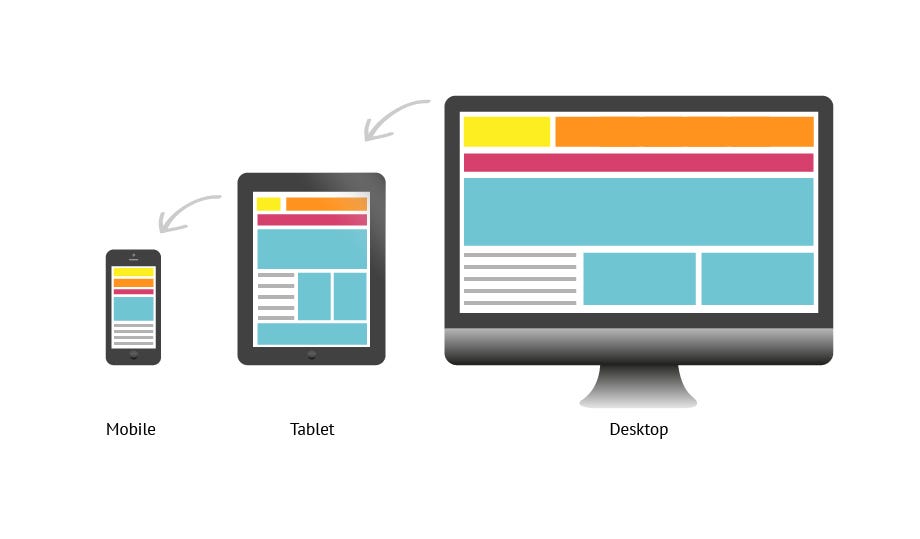
Modern web creation now includes responsive design as a crucial component due to the rising prevalence of mobile internet connectivity. Let’s examine the importance of responsive design and how it affects user experience and satisfaction, (SEO) search engine optimization, and the overall performance of the website. Your ability to construct websites that fluidly adjust to different screen sizes and resolutions will depend on your understanding of the relevance of responsive design. Users will be guaranteed the finest viewing experience possible across all devices thanks to this. The various benefits include

- Enhanced User Experience: Responsive design prioritizes user experience by providing a consistent and intuitive interface across different devices. With a responsive website, users can effortlessly navigate and interact with your content, resulting in higher engagement, longer session durations, and increased conversions.
- Improved SEO: Search engines favor responsive websites as they offer a better user experience and reduce the need for duplicate content. Your SEO efforts may be consolidated, your website’s performance can be optimized, and your search engine rankings can be raised with a single, responsive website.
- Wider Device Compatibility: Your website can adjust to different devices, such as smartphones, tablets, laptops, and desktop computers, thanks to responsive design. You may reach a wider audience and guarantee that users can access your website regardless of the device they choose by optimizing for a variety of devices.
- Time and Cost Efficiency:Building a responsive website eliminates the need for separate designs and development processes for different devices. By using this strategy, you can manage and update a single website as opposed to several versions, saving time, resources, and effort.
- Future-Proofing: As technology continues to evolve, new devices with varying screen sizes and resolutions will emerge. By embracing responsive design, you future-proof your website, ensuring it remains adaptable and accessible to users regardless of future device innovations.
Planning Your Responsive Website
Planning is a crucial first step in creating a successful responsive website. From defining goals and target audience to organizing content and designing layouts, effective planning sets the foundation for a seamless and user-friendly responsive website.
- Defining Goals and Objectives: Clearly defining your goals and objectives is essential in the planning phase. Think about whether your website’s goal is to exhibit products, offer information, create leads, or enable online sales. Knowing your objectives will direct your planning and aid in your decision-making.
- Identifying Target Audience: The ability to customize your website to their requirements and tastes depends on your ability to identify your target audience. Conduct market research to understand your audience’s demographics, behavior, and device preferences. This information will influence your design choices and ensure a user-centered approach.
- Content Organization and Hierarchy: An organized and intuitive content structure is key to a successful responsive website. Plan how your content will be organized, including main sections, subpages, and navigation menus. Consider hierarchical relationships and prioritize content based on importance and relevance to ensure a smooth user experience.
- Responsive Design Principles: Planning for responsive design involves thinking about how your website will adapt to different screen sizes. Consider layout options, breakpoints, and the rearrangement of content to ensure optimal display on various devices. Sketch wireframes or create visual mockups to visualize your design concepts.
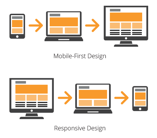
- Mobile-First Approach: Adopting a mobile-first approach involves prioritizing the design and functionality for mobile devices, given their widespread usage. Start by designing for smaller screens, then progressively enhance the layout and features for larger devices. With the help of this method, you can surely make your website responsive providing a consistent user experience on all platforms.
- Technical Considerations: During the planning phase, consider technical aspects such as choosing a responsive framework or CMS (Content Management System) that supports responsive design. Evaluate hosting options, performance optimization, and ensure compatibility with different browsers and devices.
Proper planning is the foundation for a successful responsive website. By defining goals, understanding your target audience, organizing content, and considering responsive design principles, you can create a website that delivers a seamless user experience across devices. Invest time in planning to save effort and resources during the development phase and ensure your website effectively meets the needs of your audience.
Designing for Mobile with Best Practices and Considerations
User experience, functionality, and visual appeal must all be carefully taken into account while designing for mobile devices. You can create intuitive and engaging mobile experiences that captivate your audience and drive user satisfaction by following the below steps.
- Prioritize Mobile-Friendly Layouts: Start by designing layouts that adapt to different screen sizes and orientations. To ensure that they remain visible and usable on smaller screens, pay attention to where you place crucial features like buttons, navigation menus, and key text.
- Optimize Visual Elements: Optimizing visual elements is crucial for mobile design. Use appropriate font sizes, clear and legible typography, and sufficient contrast to enhance readability. Compress images and use responsive image techniques to ensure fast loading times without sacrificing visual quality.
- Streamline Navigation: Mobile users appreciate simple and streamlined navigation. Implement intuitive menus, such as hamburger menus or tab bars, to maximize space and provide easy access to important sections. Consider using sticky headers or footer navigation for effortless browsing.
- Responsive Forms and Inputs: Design forms and input fields that are mobile-friendly. Optimize input types for mobile devices, provide clear labels, and use input validation to guide users. Consider utilizing auto-fill and input masking to streamline form completion.
- Touch-Friendly Interactions: Since mobile devices rely on touch interactions, design elements that are easy to tap, swipe, and interact with. Ensure sufficient spacing between clickable elements to prevent accidental taps and provide visual feedback for touch interactions.
- Performance Optimization: Optimize your mobile website’s performance by minimizing the use of heavy animations, scripts, and excessive content. Compress and optimize code, leverage caching techniques, and prioritize loading essential content first to reduce page load times.
- Test and Iterate: Regularly test your mobile designs across a range of devices and screen sizes to ensure consistent functionality and visual appeal. Gather user feedback and iterate on your design based on their input, making continuous improvements to enhance the mobile experience.
Implementing Responsive Web Design Techniques
Responsive web design is vital in the modern digital landscape where websites are accessed on diverse devices with varying screen sizes and resolutions. Consider this blog that contains 9 tips to create a responsive wordPress website. To create websites that provide an optimal experience across devices, implementing responsive design techniques is essential. Here are some key techniques to consider

- Fluid Grid Systems:Using fluid grid systems allows the website layout to adapt and resize proportionally based on the screen size. Instead of fixed pixel values, relative units like percentages are used, enabling content to flow and adjust dynamically. This ensures that the website maintains its structure and readability regardless of the device being used.
- Flexible Images and Media:Images and media elements need to be flexible to accommodate different screen sizes. By setting their maximum width to 100% and using CSS techniques like responsive images, the images automatically scale and adjust to fit the available space without losing their aspect ratio. This prevents images from being cropped or distorted on smaller screens.
- Media Queries and Breakpoints:Media queries are CSS rules that allow specific styles to be applied based on the characteristics of the device or screen size. By defining breakpoints, which are specific screen widths or resolutions, designers can create customized layouts and adjust the design elements accordingly. This ensures that the website looks and functions optimally on different devices.
Optimizing Images and Media for Mobile
To ensure optimal performance, quicker loading times, and an improved user experience in the mobile-centric world we live in, it is essential to optimize pictures and media for mobile devices. Here are some key considerations and techniques for optimizing images and media for mobile

- Compress and Resize Images: Compressing images reduces file size without significant loss of visual quality. By using image compression techniques, such as reducing resolution and removing unnecessary metadata, you can minimize file size and improve loading speed on mobile devices.
- Use Proper Image Formats: Choosing the right image format is essential for mobile optimization. Formats like JPEG are suitable for complex images with many colors, while PNG works well for images with fewer colors and transparent backgrounds. Consider using newer formats like WebP for better compression and faster loading.
- Retina Display Optimization: Retina displays are high-resolution screens found on many modern mobile devices. By making your website responsive to Retina screens, you can make sure that images and graphics are clear and crisp, maximizing the potential of the screen. You may give consumers with Retina screens a better visual experience by offering higher resolution versions of your images, implementing CSS3 media queries, and maximizing the use of SVG (Scalable Vector Graphics).
- Implement Lazy Loading: Lazy loading is a technique that defers the loading of non-visible images and media until they are needed. This optimizes mobile performance by reducing the initial load time, allowing users to view content faster. Implementing lazy loading can significantly improve the perceived speed and overall performance of your mobile website.
- Responsive Images: Implement responsive image techniques to serve appropriately sized images based on the user’s device. Use CSS media queries and HTML attributes like srcset and sizes to deliver the most suitable image resolution for each screen size. This prevents users from downloading unnecessarily large images, reducing bandwidth usage and improving loading speed.
- Consider Mobile-Optimized Video: Videos can be a valuable asset on mobile websites, but they can also significantly impact loading times. Consider using mobile-optimized video formats and compressing videos for mobile devices. Additionally, provide options for users to control video playback, such as autoplay settings and video quality selection.
- Minimize External Media Requests: Reducing the number of external media requests can improve mobile performance. Consolidate and optimize CSS and JavaScript files, avoid excessive use of external fonts, and consider hosting media assets on your own server or using content delivery networks (CDNs) for faster delivery.
Building a Responsive Navigation Menu
A mobile-friendly website must have a responsive navigation menu to give visitors fast access to various sections and pages. There are various website builders present to make responsive websites. In this blog, you will find the top 13 responsive website builders of 2023. Here are key considerations and best practices for building a responsive navigation menu
- Prioritize Mobile Usability: When designing the navigation menu for mobile devices, prioritize simplicity and ease of use. Consider the limited screen space and ensure that the menu is easily accessible, scrollable if necessary, and offers clear labels and icons for each menu item.
- Implement a Hamburger Menu: The hamburger menu, typically represented by three horizontal lines, is a popular choice for mobile navigation. When tapped, it expands to reveal the menu items. This icon conserves screen space and provides a familiar and intuitive navigation experience for mobile users.
- Use Responsive Design Techniques: Utilize responsive design techniques to ensure that the navigation menu adapts seamlessly to different screen sizes. Implement fluid layouts, flexible grids, and media queries to adjust the menu’s appearance and behavior based on the user’s device.
- Consider Finger-Friendly Design: Make sure that the menu items are large enough to be easily tapped with a finger. Provide enough spacing between menu items to prevent accidental taps. Use CSS techniques like pseudo-classes to enhance visual feedback when a menu item is selected or hovered over.
- Optimize Dropdown Menus: If your navigation menu includes dropdown menus, ensure they are optimized for touch interactions. Use appropriate animation and transitions to provide smooth and intuitive dropdown functionality. Avoid using hover-based interactions that don’t work well on touch devices.
- Implement Off-Canvas Navigation: Consider using off-canvas navigation for larger menus or complex website structures. Off-canvas menus slide in from the side of the screen when activated, allowing users to access the menu without cluttering the main content. This approach keeps the menu hidden until needed, providing a clean and unobtrusive mobile browsing experience.
Creating Responsive Content Layouts
Creating responsive content layouts is crucial for ensuring that your website adapts seamlessly to different screen sizes and provides an optimal user experience across devices. Here are key considerations and best practices for creating responsive content layouts
- Embrace Flexible Grid Systems: Utilize a flexible grid system that adjusts automatically based on the screen size. You may develop responsive layouts by segmenting the available space into a number of columns and rows using grid frameworks like Bootstrap or CSS Grid. This ensures that your content flows and rearranges intelligently to fit different screen sizes.
- Use Media Queries: Media queries are CSS rules that allow you to apply different styles based on the screen size or device type. By using media queries, you can define specific layout rules for various breakpoints, ensuring that your content adjusts and rearranges appropriately. In turn, this enables seamless transitions between single-column layouts on smaller displays and multi-column styles on larger ones.
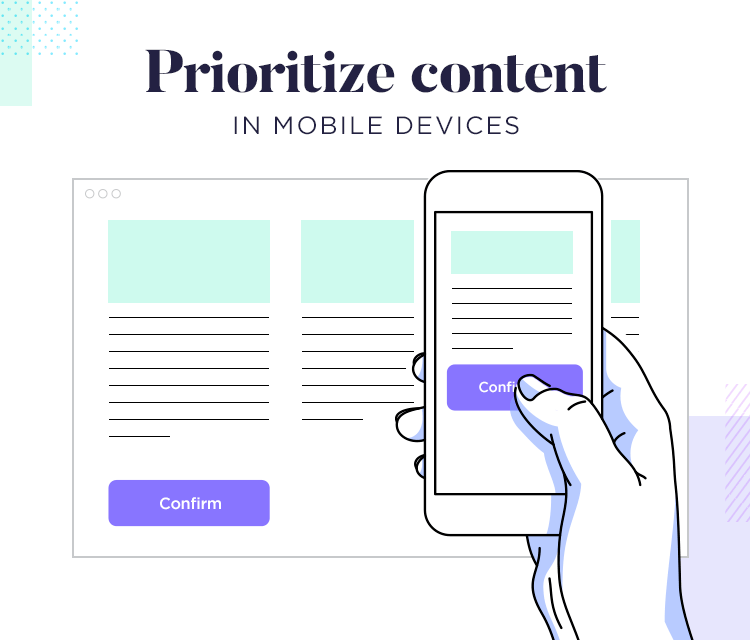
- Prioritize Content Hierarchy: Consider the hierarchy of your content and ensure that the most important elements are prominently displayed on smaller screens. Use techniques like progressive disclosure to hide less crucial content behind expandable sections or accordions, allowing users to focus on the key information without overwhelming them with too much content at once.
- Optimize Typography: Choose typography that is legible and scalable across different screen sizes. Use relative font sizes (em or rem) instead of fixed pixels to ensure that your text adapts to the user’s preferred font size settings. Also, consider line lengths and spacing to enhance readability on smaller screens.
- Responsive Images and Media: Ensure that images and media elements, such as videos or embedded content, are responsive. Use CSS techniques like max-width: 100% to prevent images from overflowing their container and maintain their aspect ratio. Additionally, consider using modern HTML features like the picture element and srcset attribute to provide different image sources based on the device’s pixel density and screen size.
Testing and Debugging Your Responsive Website
To ensure that your responsive website functions flawlessly across different browsers, devices, and screen sizes, thorough testing and debugging are essential. Here are some of the key aspects to consider when doing a testing and debugging of your responsive website

- Cross-Browser and Cross-Device Testing: To find any discrepancies or rendering problems, run comprehensive testing on several web browsers (such as Chrome, Firefox, Safari, and Edge). Test your website on various devices, such as smartphones, tablets, and desktop computers, to ensure the best possibly optimized presentation and functionality. Pay attention to differences in browser rendering engines and device-specific behaviors to make necessary adjustments.
- Performance and Page Speed Optimization: Performance and page speed optimization are very crucial for responsive websites. Large image sizes, excessive JavaScript, or unnecessary CSS files can negatively impact load times. Compress and optimize images, minify CSS and JavaScript files, and leverage caching techniques to improve overall performance. Use tools like Google PageSpeed Insights to identify performance bottlenecks and make the necessary optimizations.
- Debugging Common Responsive Design Issues: Address common responsive design issues that may arise during development. These issues may include layout misalignments, elements not scaling properly, or content becoming unreadable on certain devices. Use browser developer tools to inspect and debug your website, identifying any CSS conflicts or JavaScript errors that may be affecting responsiveness. Test your website on different screen resolutions and orientations to ensure a consistent user experience.
- Testing with Real Users: Consider conducting user testing with real users on different devices to gain valuable feedback. Observe how users interact with your website, paying attention to usability issues, navigation difficulties, or any other challenges they may encounter. Incorporate user feedback to improve the overall user experience and address any usability issues that may arise.
- Continuous Iteration: It’s crucial to regularly adapt and enhance your website depending on user input and new trends because responsive web design is an ongoing process. Stay updated with the latest browser updates and advancements in responsive design techniques, making necessary adjustments to ensure your website remains compatible and optimized across various devices and browsers.
Ensuring a Mobile-First Approach
It’s imperative to design and develop websites with mobile users in mind first. You can develop user-friendly and responsive experiences for users of smartphones and tablets by considering mobile devices right from the start of the design process. Here are key considerations for ensuring a mobile-first approach
- Understand User Behavior: Recognize the prevalence of mobile device usage and how users interact with websites on smaller screens. Study user behavior, including browsing habits, common tasks, and expectations when accessing websites on mobile devices. This information will guide your design decisions, enabling you to satisfy the particular needs of mobile users.
- Simplify and Prioritize Content: Due to limited screen space on mobile devices, it’s important to simplify your content and prioritize key information. Focus on delivering concise and relevant content that captures the user’s attention quickly. Use visual hierarchy and clear calls-to-action to guide users through the most important elements of your website.
- Responsive Design: Implement responsive design techniques to ensure that your website adapts seamlessly to different screen sizes. Utilize fluid grid systems, flexible images, and media queries to create layouts that are optimized for mobile devices. Test your website on various devices and screen resolutions to ensure a consistent and intuitive experience.
- Mobile-Friendly Navigation: Design intuitive and user-friendly navigation menus for mobile devices. Use simple and clear icons or text labels for menu options, and consider implementing hamburger menus or expandable navigation to save space. Optimize the navigation experience by minimizing the number of clicks required to access essential content.
- Performance Optimization: Mobile users expect fast-loading websites. Reduce HTTP requests, compress images, and minimize file sizes to improve the efficiency of your website. Implement caching techniques and leverage content delivery networks (CDNs) to improve page load times, providing a smooth browsing experience on mobile devices.
- Touch-Friendly Interactions: Consider touch gestures and interactions when designing mobile experiences. Ensure that buttons and interactive elements are large enough and have adequate spacing to accommodate touch input accurately. Incorporate swipe gestures or scrollable sections where appropriate to enhance usability.
- Mobile-Friendly Forms: Streamline and optimize form inputs for mobile devices. Use input types and attributes specific to mobile devices, such as date pickers or numeric keyboards. Simplify the number of required fields and provide clear instructions to make form completion effortless on smaller screens.
- Test Across Multiple Devices: Thoroughly test your website across a range of devices, including different smartphone models, tablets, and operating systems. Pay attention to how your website renders and functions on various devices, ensuring a consistent and satisfactory experience for all users.
By adopting a mobile-first approach, understanding user behavior, simplifying content, implementing responsive design, optimizing performance, designing touch-friendly interactions, creating mobile-friendly navigation, optimizing forms, and testing across multiple devices, you can ensure that your website provides a seamless and user-centric experience for mobile users, ultimately driving engagement and satisfaction.
Monitoring and Improving Mobile Responsiveness
Achieving and maintaining optimal mobile responsiveness is a continuous process that requires monitoring and improvement. By regularly assessing the performance and user experience of your mobile website, you can identify areas for enhancement and ensure that it remains fully responsive across various devices. Here are key steps to monitor and improve mobile responsiveness
- Performance Monitoring: Maintain regular performance monitoring of your mobile website to spot any snags or problems that can impair responsiveness. Utilize tools like Google PageSpeed Insights or GTmetrix to measure page load times, optimize file sizes, and identify opportunities for performance optimization.
- User Testing and Feedback: Conduct user testing sessions with real users on different mobile devices to gather feedback on the mobile experience. Observe how users navigate through your website, identify pain points, and collect insights on areas that need improvement. Consider implementing feedback mechanisms such as surveys or feedback forms to gather user opinions on mobile responsiveness.
- Responsive Design Auditing: Conduct regular audits of your responsive design implementation to identify any design or coding issues. Ensure that breakpoints are appropriately set, elements are scaling correctly, and content remains readable and accessible across different screen sizes. Verify that media queries are effectively adjusting layouts and styles based on device characteristics.
- Continual Optimization: Implement iterative improvements to enhance mobile responsiveness. Optimize image sizes and formats to reduce page load times. Refine CSS and JavaScript to minimize render-blocking and improve overall performance. Optimize touch interactions, such as button sizes and spacing, to enhance usability. Leverage browser caching and content delivery networks (CDNs) to further improve performance.
- Responsive Analytics: Monitor analytics data specifically related to mobile usage to gain insights into user behavior and engagement. Analyze metrics such as mobile traffic, bounce rates, conversion rates, and average session duration to identify areas for improvement. Use this data to inform your optimization efforts and prioritize enhancements based on user preferences and needs.
Conclusion
Building a responsive website for mobile devices is now necessary in today’s mobile-driven environment; it is no longer a choice. You can guarantee an excellent user experience across all devices and screen sizes by putting the suggestions and best practices discussed in this extensive article into practice. From planning and designing to implementing responsive techniques and rigorous testing, every step is crucial to achieve a truly responsive website. Remember, the key is to prioritize mobile users and create an intuitive, visually appealing, and fast-loading website that adapts seamlessly to their needs. You can increase user engagement, increase conversions, and maintain an edge over the competition in the always changing mobile landscape by putting in place an adaptable website.
FAQs
What is a responsive website?
A responsive website is designed and developed to adapt and display content seamlessly across various devices and screen sizes, providing an optimal user experience.
Why is it important to have a responsive website for mobile?
A flexible website for mobile is essential since it makes sure that users of smartphones and tablets, who account for a sizeable number of internet users, can visit your website and find it visually appealing.
How can I make my website responsive for mobile?
To make your website responsive for mobile, you can follow best practices such as using responsive design frameworks, implementing flexible layouts, optimizing images and media, and utilizing CSS media queries to adapt the design based on different screen sizes.
Do I need to build a separate mobile website or a mobile app?
Building a separate mobile website or a mobile app is not necessary if you implement responsive web design techniques. Responsive design allows your website to adapt to different devices, eliminating the need for multiple versions.
What are some key considerations for designing a responsive website?
Important considerations include ensuring intuitive navigation, optimizing loading times, prioritizing content for smaller screens, utilizing touch-friendly elements, and testing the website across various devices and browsers.
Will a responsive website improve my search engine rankings?
Because they offer a consistent user experience across devices and because search engines like Google give preference to mobile-friendly websites in their search results, responsive websites do indeed tend to have higher search engine ranks.
Can I update my existing website to make it responsive?
It is feasible to make an existing website responsive by updating it. The website’s complexity, nevertheless, may necessitate considerable changes to the underlying code and design.
How can I test the responsiveness of my website?
You can test the responsiveness of your website by using browser developer tools to simulate different devices, utilizing online responsive design testing tools, and conducting real-user testing on various mobile devices.
Do responsive websites perform well in terms of loading speed?
Responsive websites can be optimized for loading speed by implementing techniques like image compression, caching, and minimizing HTTP requests. Optimising performance is essential to ensuring a quick and seamless user experience.
Are there any ongoing maintenance requirements for a responsive website?
Yes, maintaining a responsive website involves regular updates, monitoring for compatibility issues, optimizing performance, and adapting to new devices and technologies to ensure continued mobile responsiveness.